Pepsi Is Updating Its Logo For The First Time Since 2008
Logo design is a tricky business that can strike fear in the hearts of executives — especially those in charge of sales and marketing. In a crowded marketplace, brand identifiers are important. What's more, consumers become attached to the visual representation of a beloved brand. Thus, marketing executives, ad agencies, and top-level graphic designers are often tasked with balancing history with modern tastes as well as a well-earned brand identity and the potential for marketplace confusion.
It's easy to see how this can be overwhelming. And yet, brands review their logos all the time, sometimes making minor tweaks with relative frequency and other times unveiling major overhauls seemingly once an epoch.
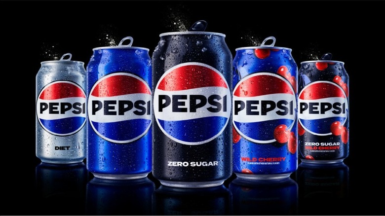
Recently, Pepsi announced the latter, debuting its first new logo since 2008. The change goes deeper than that, though, as the logo is just part of a visual identity refresh that will usher in the "brand's next era," according to a press release. While the iconic red, white, and blue globe is still in place, the color palette has been modified with more contrasting electric blue and black, and the typeface has been updated to a modern bold one. Additionally, there is a new can silhouette, and the brand's trademark pulse design has been updated to evoke "ripple, pop, and fizz."
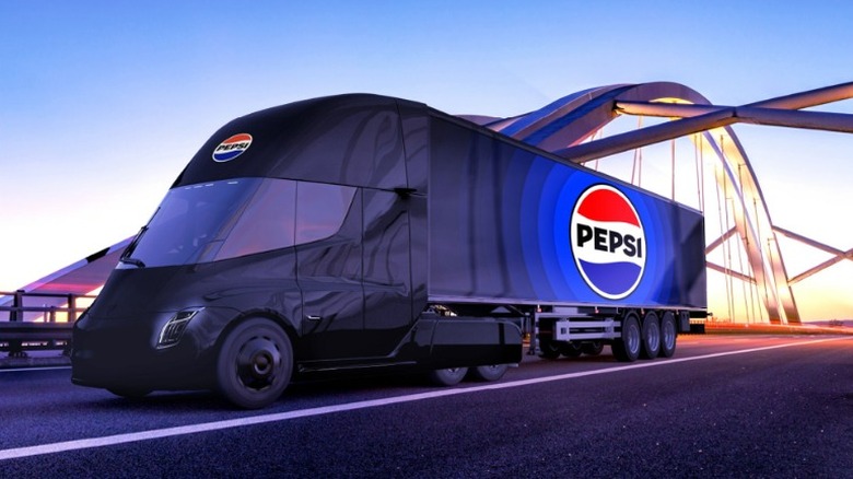
The official debut will begin in North America in the fall of 2023, coinciding with the 125th anniversary of Pepsi. This will expand in 2024 to international markets, and include all digital channels and packaging, dining touchpoints, soda fountains and coolers, clothing, and transportation vehicles.
A step forward, a nod to the past
The totality of the branding refresh and new logo design may come as a shock to some consumers who have grown accustomed to Pepsi's current thinner, rounded typeface and avant-garde globe logo. But the beverage company said that its aim with the redesign is keeping with the ethos that has always driven the brand's marketing, namely one that "has maintained a bold challenger mindset and a strong link to pop culture."
But eagle-eyed consumers — and those of a certain age — may find the new logo and brand design less forward-thinking and more similar to something they've seen before. Speaking with USA Today, Pepsi's chief marketing officer Todd Kaplan stated that focus groups had an affinity for the brand name inside the globe as well as logos that the company had used in the 1970s and 1980s.
Pepsi has long struggled with comparisons — fair or not — to its major competitor Coca-Cola, and early logos featuring "Pepsi-Cola" in fanciful, flowing red letters did little to squelch the competition. It wasn't until the 1950s when blue was added to the brand color scheme that definite points of differentiation beyond the name were included. That continued into the 1960s as "cola" was officially dropped from the brand name and all packaging.

