Graphic Designer Breaks Down Jell-O's Nostalgic Rebrand & New Logo
Jell-O might be a childhood staple, but it is old — like, created in the first half of the 19th century old. The product has had its fair share of rebrands since 1845, but it has been a decade since its last. According to a press release sent to Tasting Table, another refresh was in order — one that the brand hopes will fully capture "the jiggly fun that Jell-O brings to parents and kids alike."
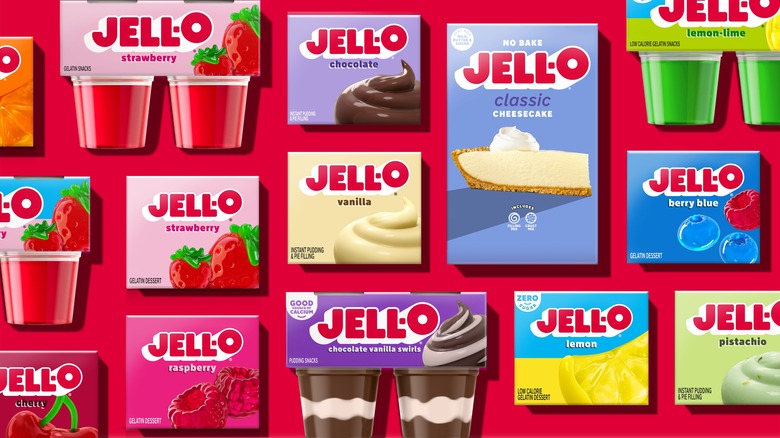
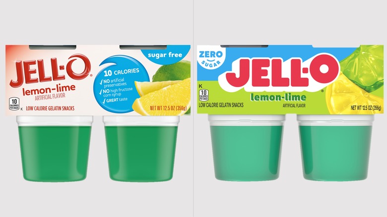
How is it different? Well, speaking just to the logo, you'll notice the clean, chunky letters and deep relief embossment that give it an eye-popping 3-D effect. And if you look closely, you'll see that the "O" has, as the release put, "come to life," suspended in a state of jiggly recoil, leaving behind the swirl that has marked it since 2003.
We reached out to graphic designer Erik Carter for his thoughts on Jell-O's motives for this rebrand. Carter told us, "Rebrands mainly happen for two reasons: companies want to take whatever they are doing 'to the next level,' or something is going wrong, likely the tastes of society cooling to whatever it is the brand is selling." In his opinion, "Jell-O as a brand feels out of time, once used for kitsch dessert recipes or a quick snack for kids ... [and] such a drastic rebrand can only mean that Jell-O is throwing a Hail Mary to the public, screaming to us all that there is now more pop, more color, more fun, even if the recipe has remained unchanged."
What works and why?
On the specific changes that Jell-O has made to its logo, Carter, who runs Design Harder, a design criticism Substack, notes that it is in keeping with trending brand design aesthetics and the "current moment of neo-nostalgia that paints the soda aisles in your local Whole Foods." This is particularly noticeable in the flat drop shadows that are evocative of branding that comes from a different era.
Another change Carter picked up on is the use of illustrations of fruits on the packages rather than photos of real fruit, which were previously used. This is a good move, as he explains that there is little point in trying to make such an explicit connection to real fruit when there is no perception that one's eating real fruit when they reach for a cup or envelope of Jell-O.
As to whether or not the rebrand will work, Carter peels back the curtain on his own industry a bit. "Graphic design is a dark alchemy, it changes how we think about something but how well that magic permeates is really up to the buyer," Carter says. "At the end of the day, the truth of Jell-O is that it will always be Jell-O: a colorful jiggle in a cup of plastic." Expect to start seeing the new Jell-O logo on store shelves soon as the rebrand rolls out across the entire product line starting this month.

