The Intentional Imperfection Behind The Starbucks Logo Design
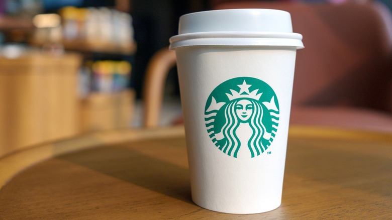
Companies using logos to communicate messages isn't a new marketing strategy. You may have noticed the symbolic 31 hidden in the Baskin-Robbins logo (which was also recently updated) or the bear tucked into the mountain printed on Toblerone packaging. Similarly, the Starbucks logo that has made international rounds on cups and store signs has been carefully crafted with so much intention that even small shadows have been drawn with purpose. Before an early 1990s revision, the siren representing the Starbucks brand was more symmetrical in design.
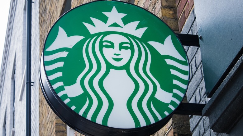
Though certain creative decisions made in 2011 may have been last minute adjustments to the evolving feature, the impact was significant. The company's creative leadership recognized that a symmetrically perfect face didn't fully represent what Starbucks wanted to stand for. Instead of replicating an image that looked flat or appeared drawn like a mask, a shadow and small dip on one side of the siren's nose helped convey a relatable human element in the mascot's facial features, and thus, the humanness driving the coffee company's mission.
Embracing imperfections
It is well known that the Starbucks logo has gone through several variations since the company's conception. The original NSFW logo, which dates back to 1971, was a two-tailed mermaid-looking creature with a bare torso, and the image generated quite a few controversial sentiments. In 1987, the logo was redesigned, yet this wouldn't be the only edits the siren would undergo. Just as the first Starbucks store contains thoughtful pieces of history, plenty of interesting facts about the original inner-workings of the store, and more than a few hidden Easter eggs, the logo, too, holds plenty of tokens that represent Starbucks' evolution.
For one, the siren has been progressively zoomed in over the years, and her more revealing aspects have been covered by long, flowing hair. As seen today, the subtle asymmetrical feature on the upper right side of the siren's face is a detail with a noticeable impact. This shadow on the side of the character's nose is extended, an intentional line that helps represent an entity that is both approachable and human. Some may even go so far as to say that this natural flaw helps consumers embrace their own imperfections.

