Every Starbucks Logo Design Throughout The Company's History
The perfect brand logo can be a powerful tool. Without taking a single sip, the sight of Coca-Cola's logo evokes a feeling of refreshment. The same can be said for McDonald's Golden Arches, which immediately make you crave the chain's World Famous Fries. Any number of things can inspire a brand's logo, like a manifesto, the founders, or its home base. For example, Coca-Cola's timeless logo hasn't changed much since being introduced in 1886.Its creator, Frank M. Robinson, chose the Spencerian cursive script because it was popular yet unique for a soda at the time.
Starbucks' Siren is another among the pantheon of globally recognized logos. Its iconic green color is a lighthouse for coffee lovers worldwide. With over 40,000 locations, you'd have to dig under a rock to find someone unfamiliar with it. The twin-tailed logo we know today has evolved with the changing tide, though never strayed from its seafaring roots. Logo redesigns aren't the easiest to pull off successfully, either. However, those that are successful retain the brand's essence, and Starbucks has impressively achieved that. Here is every logo design the company has used throughout its history.
The Starbucks Siren's First Iteration (1971)
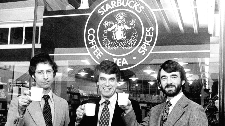
The first Starbucks store opened in 1971, located at Seattle's historic Pike Place Market. It was 1,000 square feet with large windows on either side of the front entrance, one of which held the original Starbucks logo. Unlike today's contemporary design, the OG logo was brown, more complex, and circle-based. Encircled by the words "Starbucks Coffee ‧ Tea ‧ Spices" was a full-bodied NSFW version of the brand's twin-tailed siren with bare breasts. It was designed by Terry Heckler, a renowned marketer instrumental in developing brands like New Balance, Cinnabon, Panera, P.F. Flyers, and others.
Heckler and Gordon Bowker, one of the founders of Starbucks, were creative partners at the time. The design was inspired by the coffee trade's maritime history and Puget Sound, an interconnected system of waterways and basins along Washington's coast.Heckler came upon an illustration of a mermaid in a vintage marine book: a twin-tailed sea nymph from Greek mythology who lured vessels to a ruinous end. According to Heckler, it was "the perfect metaphor for the siren song of coffee that lures us cupside" (via the Starbucks ). The same siren is still the face of today's Starbucks logo.
Modernized update with new Il Giornale green color (1987)
Starbucks stuck to its NSFW guns and kept its original logo until the 1980s. It was still a local chain at the time, so it avoided the controversy it would likely face today. Starbucks was acquired by Il Giornale in 1987. Il Giornale was and offshoot company launched by one of Starbucks' founders, Howard Schultz, who parted ways to focus on selling Italian-style espresso. The two companies remained tethered, though, with Starbucks continuing to supply the coffee beans for Il Giornale's drinks. Schultz paid $3.8 million for the coffee chain's assets and name, changing it to Starbucks Corporation.
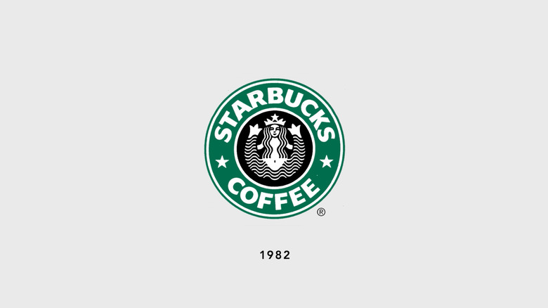
The next significant change came in the form of a logo redesign. Terry Heckler took inspiration from both companies to represent the new merger. He swapped the dull brown color of the original logo with the iconic green Starbucks still carries and put a modernized spin on the siren. Instead of the detailed vintage-style illustration, he created a simplified line-art version, replacing the intricate scaly tails with wave-like ripples, the interpunct dots with stars, and responding to the times by covering the bare breasts with hair strands. Heckler chose to keep the circular framing, but reduced the wording to "Starbucks Coffee."
The Starbucks Siren's face becomes logo centerpiece (1992)
Between 1987 and 1992, Starbucks grew from a small coffeehouse chain with 17 locations to an international one with 165. With growth, it began offering employee health benefits, expanded its Seattle headquarters, became the first privately owned chain to offer stock options, and even opened its first licensed airport store at Sea-Tac International. More cities than ever were in the shadow of its ever-growing footprint, bringing about the chain's third logo redesign.
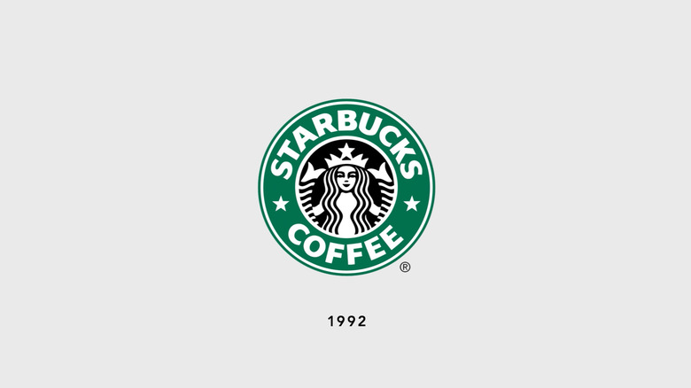
The next iteration was a subtle shift from the previous. Terry Heckler kept the simplified line-art design and merely adjusted the size of the Starbucks siren, cropping the twin tails and making her face the centerpiece. From then on, the smiling siren became the new branding for all Starbucks merchandise. In 2008, however, Starbucks relaunched the original logo in an attempt to stoke nostalgia. According to Under Consideration, the move was not received well, forcing Starbucks to quickly revert to its beloved siren.
Today's contemporary-style logo is launched for 40th Anniversary (2011)
Starbucks grew exponentially between 1992 and 2011, adding 16,838 locations to its portfolio. It became a true internationally-known brand, with coffeehouses in countries like Japan, China, Australia, the United Kingdom, Kuwait, and Germany to name a handful. The fan-favorite Frappucino was introduced, Starbucks hit grocery store shelves, and it also acquired other Seattle-based coffee brands. The Starbucks train was brewing full steam ahead.
What better way to celebrate its 40th anniversary than to give the logo a contemporary-style update? Terry Heckler was put to the task yet again, this time challenged with making an already perfect logo, even more so. He distilled the Starbucks logo down to its most memorable feature: The twin-tailed siren. Removing the circular frame and wording completely, he enlarged the center siren design with cropped tails, though retained its round shape. Heckler masterfully added an intentional imperfection behind the Starbucks logo design that communicates everything fans have come to love about the brand. The fourth iteration has remained unchanged for 14 years and looks like it isn't going anywhere, anytime soon.
