The Popular Candy Brand Logo That Artist Salvador Dalí Actually Designed
We may receive a commission on purchases made from links.
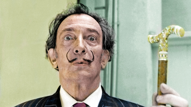
Salvador Dalí, the iconic surrealist artist known for melting clocks and dreamlike paintings, is also the genius behind one of the most recognizable candy logos in the world — Chupa Chups. Those little round lollipops wrapped in bright, crinkly paper have been delighting people with a sweet tooth since the 1950s. In 1969, during a casual meeting with his friend and the brand's founder, Enric Bernat, Dalí was asked to help modernize the company's branding. Over coffee, he sketched the logo on the spot using bright yellow and a bold red script, completing a design re-do in under an hour. Far from a throwaway favor, Dalí's contribution became a lasting visual identity that helped shape the brand's success for more than 50 years.
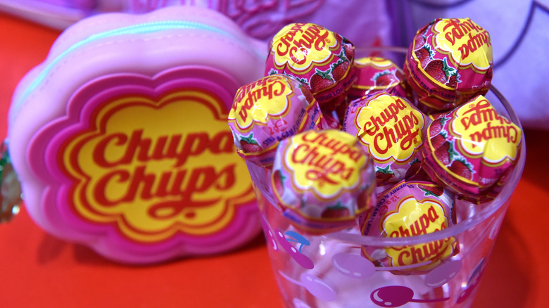
By the time Dalí redesigned the logo, Chupa Chups were a household name in Spain, but things were a little different. Founded in 1958, the lollipops were similar to Tootsie Pops, but without the candy center. They were originally called "Gol," a name chosen to reflect their soccer ball-like shape. When Bernat changed the name to "Chups," inspired by the Spanish verb "chupar", meaning "to suck," and introduced a catchy jingle, a new brand was born. But Dalí's idea to place the logo on the outside of the lollipop's wrapper was the real genius move. Lollipop logos were usually placed on the sides, which would be torn (and unreadable) upon opening. By centering the logo on the top of the wrapper, it was legible, even after unwrapping. The logo design itself was revolutionary, too.
It wasn't surreal, but the design was simple, bold, and sweet
Dalí surrounded the brand name with a cheerful yellow daisy, a shape that made the hard candy on a stick feel playful, sunny, and instantly recognizable. It also subtly nodded to the innocence of childhood, echoing the tone of Spanish nursery rhymes like "Debajo de un botón." His use of red and yellow, vibrant and emotionally charged, helped the lollipops stand out in stores. After Dalí's redesign, the brand expanded into France in 1969, Japan by 1977, and eventually the United States, Germany, and beyond. By the 1990s, Chupa Chups were being sold in more than 150 countries, with factories operating across Europe, Asia, and Latin America.
Today, Chupa Chups come in more than 100 flavors, from classics like strawberry to inventive cream-filled varieties and even sour candy flavors. You can even buy an entire display with 120 of them for under $100 (hello, party favors). And yet, despite its global footprint, the iconic logo remains almost untouched—a testament to the enduring power of Dalí's fast but brilliant design. The brand's global growth was fueled not only by its bold, recognizable logo but also through clever marketing partnerships with stars like Madonna and The Spice Girls in the '90s. In the end, Dalí's surrealist mind gave birth to something unexpectedly timeless — a logo that was both artistic and commercial, and a good example of high art sweetening our (lolli) pop culture landscape.

